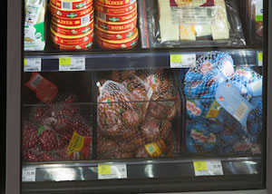
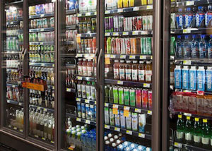
Don’t fear closed cases. Apply good design behind doors to create compelling displays.
Supermarket merchandisers often approach glass-fronted refrigerated cases with anxiety, worrying about how they’ll build a display irresistible enough to get shoppers to reach inside. That is, until they realize the secret to closed-case merchandising is something they already know: Good design works anywhere.
Incorporate strong design principles into food displays behind expanses of clear glass, and shoppers will be just as compelled to buy as they are when they stand in front of open cases. In fact, putting doors on refrigerated cases can even make your displays more engaging.
Guide the shopper’s eye

Let’s start with any supermarket merchandiser’s No. 1 job: controlling the shopper’s eye. Every refrigerated case door creates an opportunity to do just that by narrowing the shopper’s field of vision and directing it to the focal point of your choosing.
Remember, the same props and accessories you use in open cases work behind doors, too. Clear bins keep merchandise organized and allow. Products grouped by similarities, such as shape or color, guide the shopper right where you want her to look.
Tell a story behind the door
The frame of a closed case offers an ideal way to create a compelling and compact story—one that’s understood at a glance. What’s the tale being told behind a door where shelves are filled with bands of colorful cut produce? Health and convenience. What does a shopper see when richly veined rib-eyes are displayed alongside baskets of gourmet cheese and recipes for blue cheese-topped steak? Indulgence.
Here, again, the same techniques and tools—such as baskets and cutting boards—that you use to cross-merchandise elsewhere in the store work great behind doors.

Think of closed cases as food galleries
The visual stimuli on store shelves can be overwhelming to consumers. All those shapes and colors can create sensory overload—especially when a shopper is strolling past vast stretches of open refrigerated cases. But add doors to those cases, and you define the field of vision. Shoppers see one area at a time and look where you guide them.
It’s the approach a curator takes in an art gallery. Line up canvases right next to each other, and the art becomes noise. Frame and separate the paintings, and they harmonize. Glass doors accomplish the same thing with your refrigerated products. For example, the right in-case lighting and clear plastic self facers turn boxes of produce into museum-quality displays of fresh, green goodness.
Shift the shopper’s perspective
Traditional supermarket displays pull the shopper from side to side. But closed cases create a horizontal point of view. Merchandise similar items behind a single door to create vertical sectors that change the scene—and refresh the shopping experience. Use standard merchandise dividers to maximize shelf space and drive the eye up and down. Yogurt containers pop, and beverage displays gain style and symmetry.
The secret to closed-case merchandising isn’t such a mystery after all. Create an attractive, well-ordered display using the same design principles that work in other parts of your store, and shoppers will open the door every time.